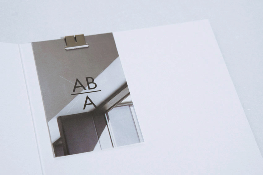
ABA,
Creation & development of visual identity
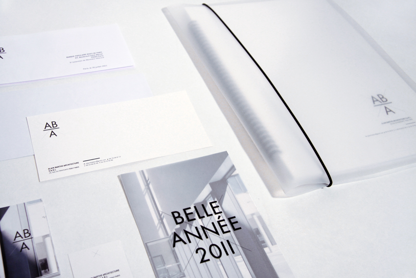
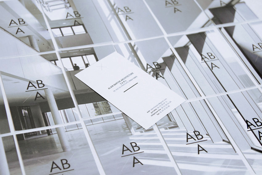
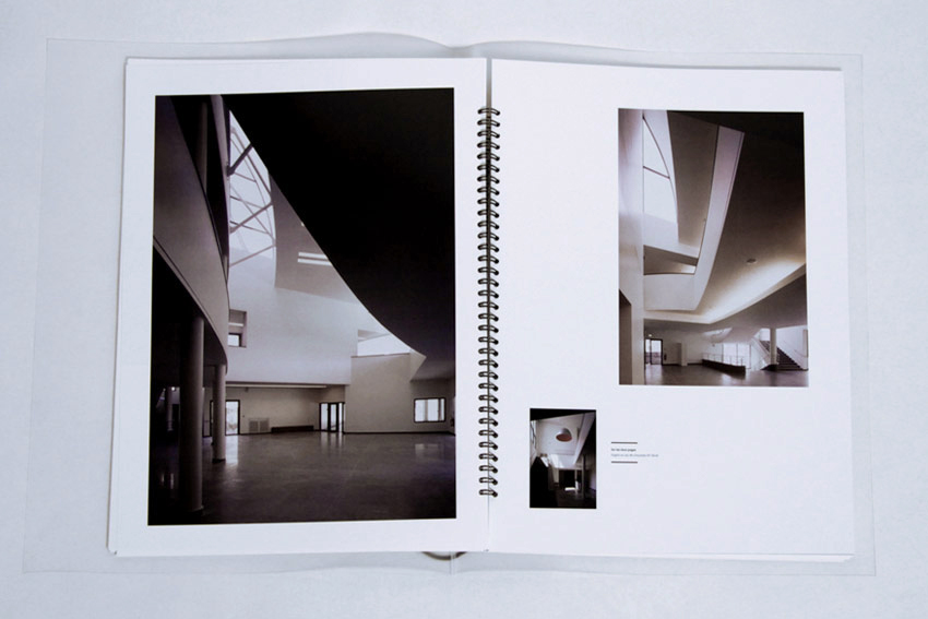
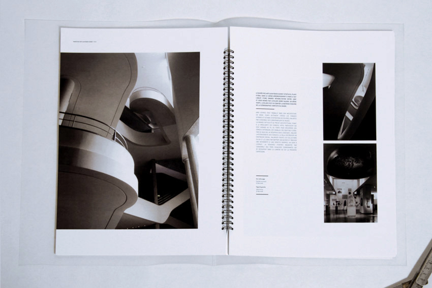
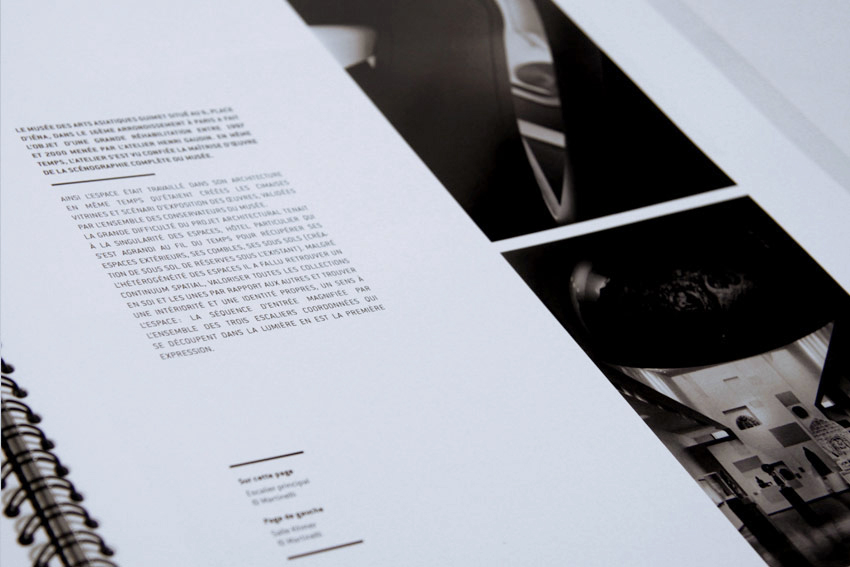
Aba is a young architecture agency looking to promote its works, in which light and technical know how are central.
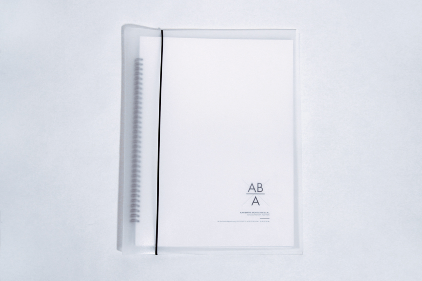
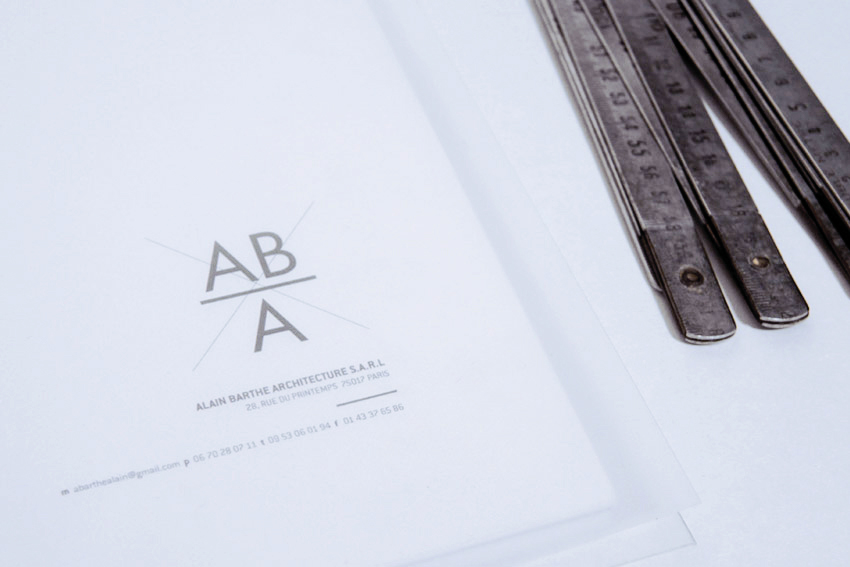
We thus designed the identity playing with transparency, & putting photographies forward by playing with textures (tracing paper, transparent paper). The logo, in balance, represents an equation. A cross is watermarks stands behing it, reminiscent of construction plans’ vocabulary.
# direction artistique – print – charte graphique – website – outils presse

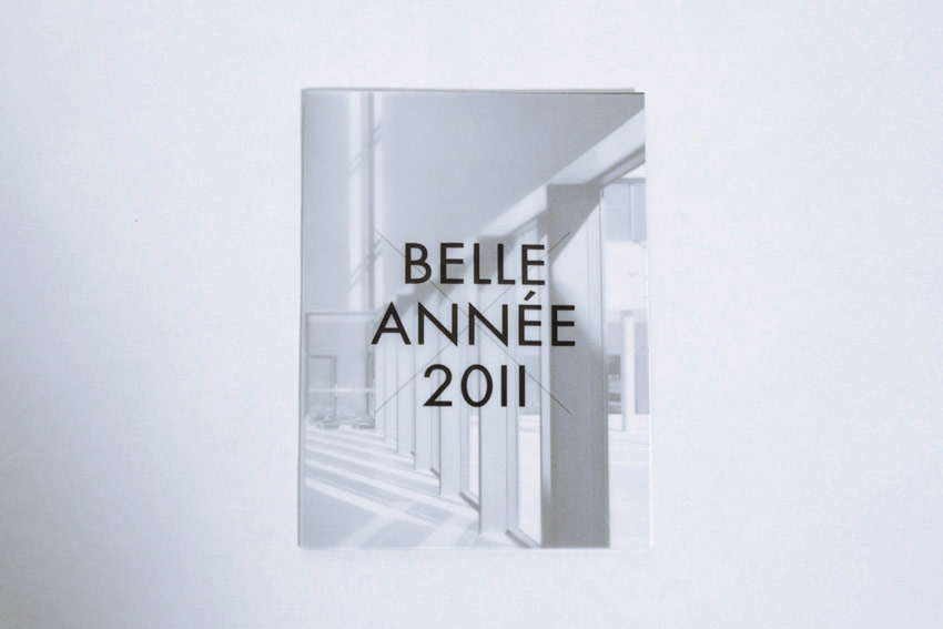
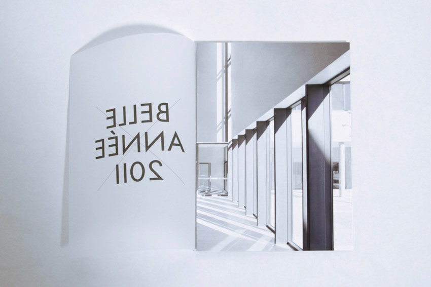
Year:
2011
Communication means:
business cards, greetings cards, stationary, book
Printing:
numerical & hand bound
Papers:
Cryogène White & tracing paper