Creation of visual identity
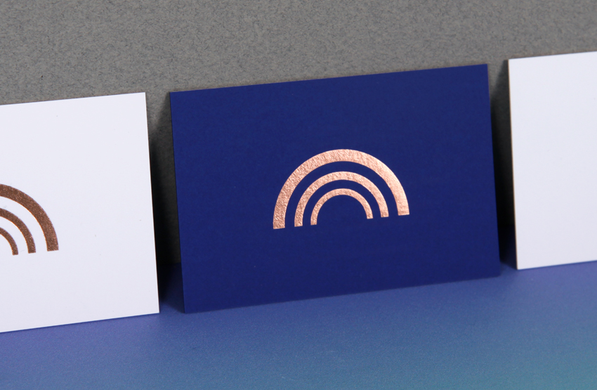
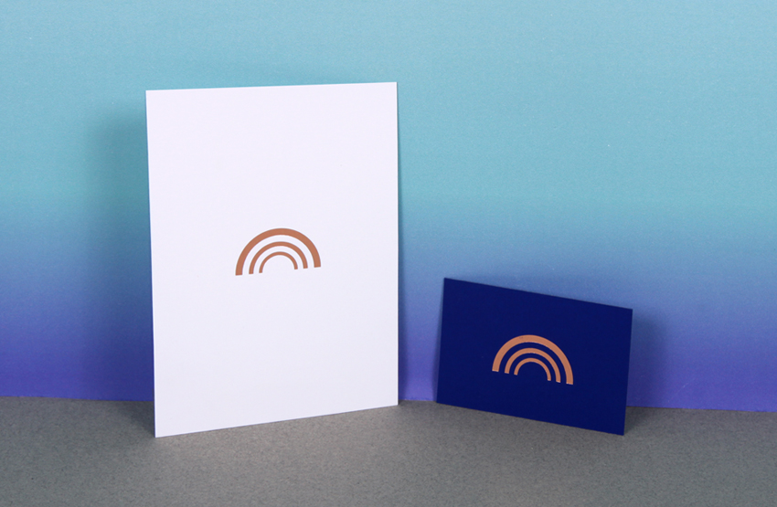
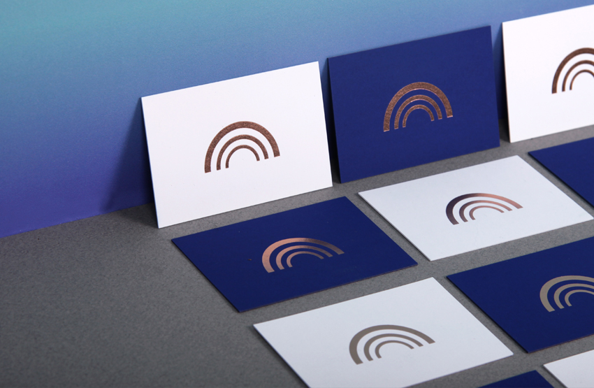
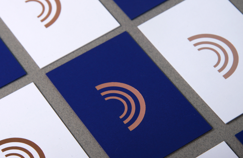
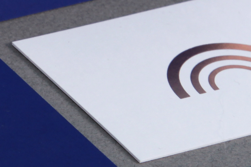
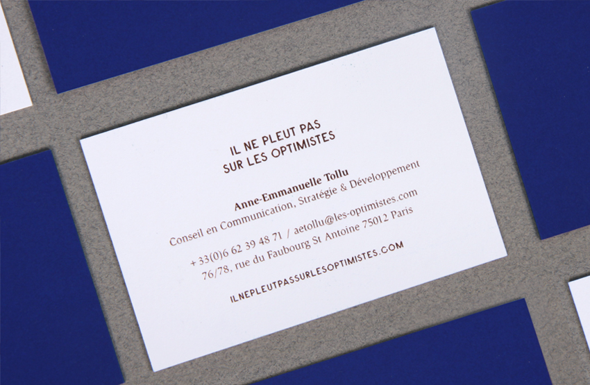
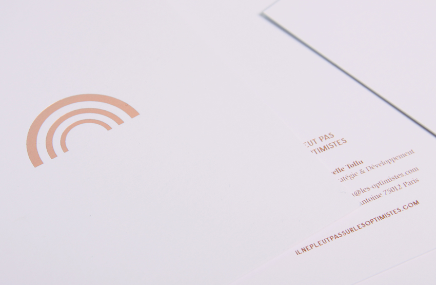
Il ne pleut pas sur les Optimistes is communication agency – specialised in premium brands – runs by the dynamic and enthusiastic personality of the founder, Anne-Emmanuelle Tollu. For the logo we designed a polysemious sign, that can be seen as a rainbow (appearing in the sun, after the rain), as wave referring to the idea of diffusion,
spreading – an essential in communication, but also, when the sign is upside down it can be a very 2.0. smiley face. Pure and strong colours, royal blue and pure white, highlights the stronghness of the sign, hot stamped in pinkish copper.
# art direction – identity – print – website – graphic charter

Year:
2015
Communication means:
stationnary, website, press release
Printing:
hot stamping
Papers
Curious Matter Adiron Blue & Goya White 270gr