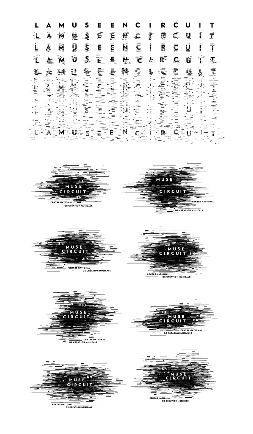
We thus create a multifaceted and continuously evolving logo, a cloud that by definition has no limits.
Its essence, an accumulation of lines, becomes a noise, a crackle, the symbol of La Muse’s creative research.
It’s also a disturbance, first a graphic one, but also a disruptive element within the institutional context the center takes part of.
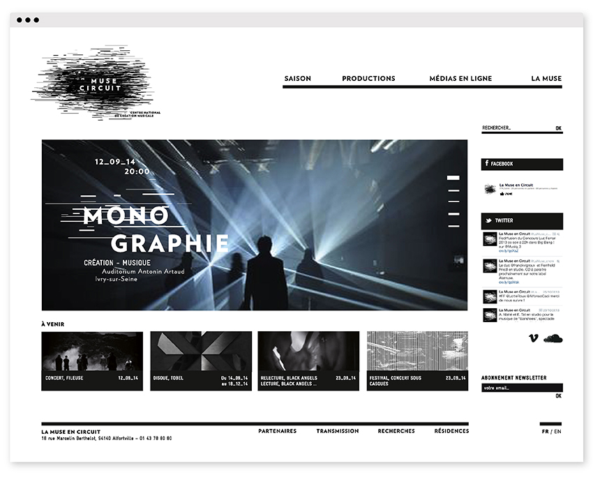
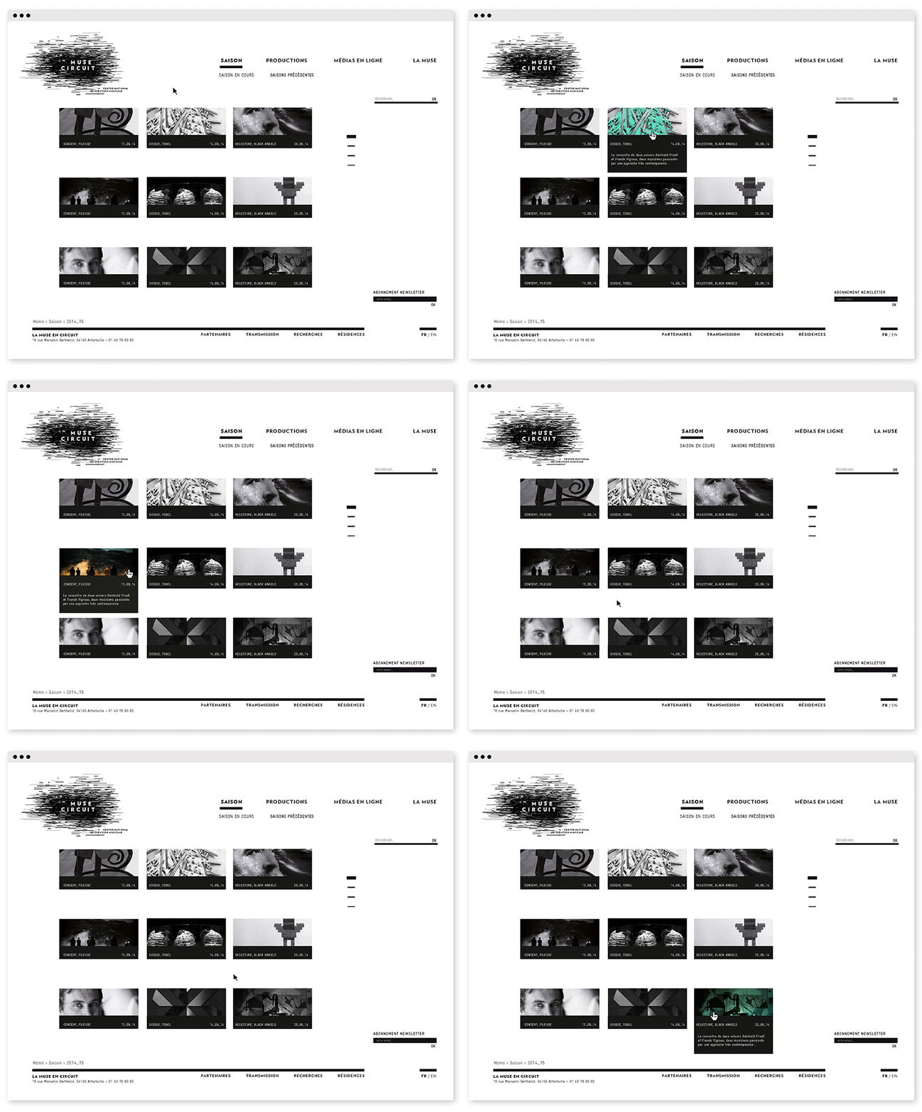
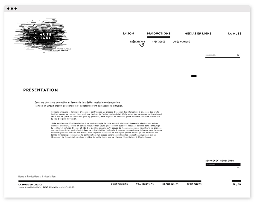
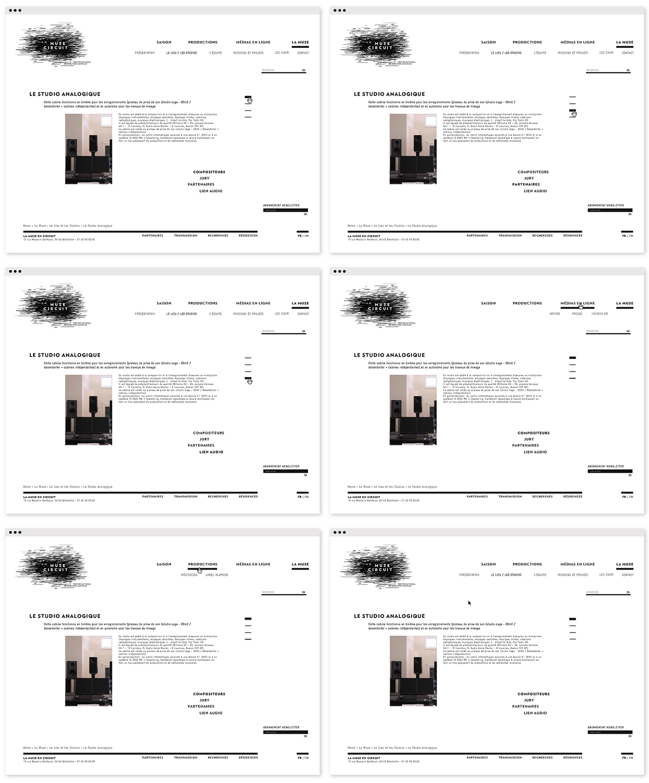
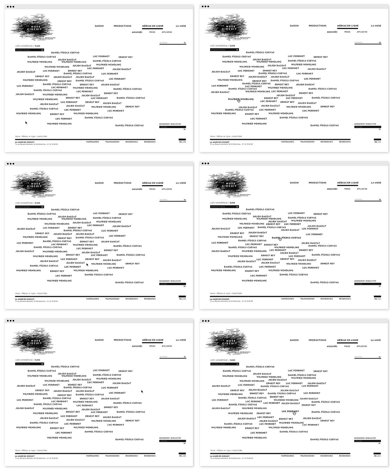
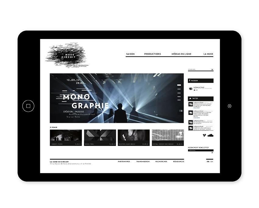
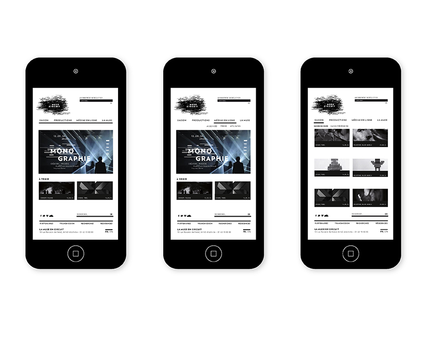
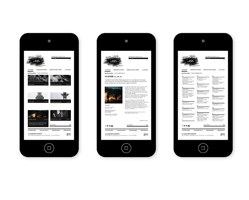
For the website, extremely rich in content, we make sure we preserve clarity and purpose, and keep it user friendly. We thus decide to take the basic component of the logo – a black rectangle – and let the user animate it while using the website.
Year:
2014
Communication means:
logo & website
Motion design:
HANDS Studio
website developer:
Lowpolar
Website:
www.alamuse.com
